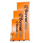
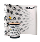
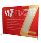
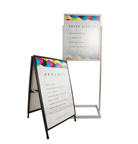
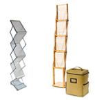
A business that is seeking to attract high numbers of visitors, or leads to their products or services at a conference or tradeshow must have a distinctive, well-designed banner stand. Your exhibition stand should be instantly recognizable, make a good impression, and have that wow fact. Your business may offer the best service or product, but with limited visual attraction, your potential clients could move into your competitors’ hands.
Enhance your marketing at trade exhibitions with these top features for exhibition stands:
Maximize Booth Space
Typically, booth size is limiting, and so it is necessary to maximize your allocated space to its full potential. Ensure you confirm the booth dimensions with event organisers in advance, so that you’re aware of how much room you have in order to plan your space. Enhance the flow and accessibility of the exhibit area by removing any physical barriers, obstructions to the entry. Also, keep the banner stands at the front while the meeting area should be allocated to the back.
The Right Amount of Text
When designing portable banners for your stand, less is often better. Clear and conciseness is critical here. Steer away from long phrases and sentences if you can use single words to pass a similar message. Catchy slogans work better on your portable banners, instead of listing exhaustive product information. The visitors who are scanning through the booths won’t stop and read your lengthy copy.
Lighting is Essential
Besides having attractive pull-up banners, lighting also plays a massive role in enhancing the overall aesthetic appeal. If used effectively, lights can create different ambiance and moods depending on desired outcomes. Consider bringing additional lighting to the event and not relying on what the venue supplies. Coloured lights, spotlights, and up lights can work perfectly in highlighting specific places within your stand.
Include Unique Graphics
Nowadays, people have very short attention spans, especially somewhere like an exhibition where this is a lot going on. Graphics and images are compelling and quick mediums that you can use to communicate complex ideas or messages rather than using loads of text. As with your text placement on pull-up banners, consider where you place your images. Ensure they are visible and aren’t concealed even from a long distance. Life-sized photos are especially compelling for exhibition stands.
Use Different Materials
By using different materials away from the norm, you can reinforce your brand image and create a more attractive exhibition stand. For instance, tech companies can use modern designs with chrome detailing and aluminium panels.
Focus on the Right Audience
Who are your target visitors or leads? Once you know who you want to attract, you can form a foundation for the most effective way of communicating your message or presenting your service or product. The best banner stands may look great, but if you haven’t considered your Audience, then you could attract the wrong prospective visitors.
Conclusion
Build a full atmosphere in your display stands with these tips shown here. Everything from the portable banners to demos and lights to layout should stimulate your visitors. Remember to measure the stand’s effectiveness by evaluating the number of visitors or orders processed at the end of the event.
Read Also:
