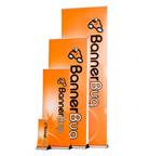
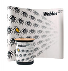

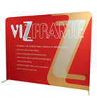

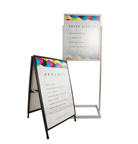


Choosing the right colours for your banners plays an integral role in the marketing of your business. Your banners are tools to draw potential customers into your exhibition display. It’s important that you get your colour scheme right. The banners should reflect your brand and create an exciting and inviting display.
Coloured banners are more than just eye-catching tools to promote your business. Did you know colours can evoke an emotional response and affect the way people perceive their environment? Certain tones evoke physical and mental responses when viewed.
Colour is an integral part of the visual representation of your brand and can communicate your brand’s personality. Using colours to evoke a customer response is another element to add to your exhibition display.
Red
For instance, how many brands can you think of that use the colour red in their signage and logo? There are too many to list. This is because the colour red is eye-catching. People all over the world are used to seeing the colour red on stop signs. It can make things seem closer than they appear. You can use red banners to draw attention to your display, make people stop and pay attention. Maybe you need to relay some vital information or attract attention to a key feature or product? Red banners are perfect for this application. You might even want to consider using red for your brand’s colours.
Blue
Blue is often used as brand colours for the technology industry. This is because blue is associated with communication and wisdom. Looking at blue is also said to have a soothing effect on the viewer. Blue connotes competence and is often used in corporate branding.
Pink
Pink is often associated with femininity and sophistication. If you look around your local shopping mall you will notice that most lingerie shops and cosmetic companies use some form of pink in their branding.
White
White is often associated with purity. Think of all the beauty product commercials and you will notice most of them have an almost heavenly white appeal to give of the perception of cleanliness and purity.
Violet/Purple
Purple or violet represent authority, power and sophistication. It also connotes an essence of luxury or royalty.
Utilising the attributes of various colours can give you an edge when you promote your brand. Customers judge in the first ninety seconds of recognition. Usually, the first impression is of the company’s branding.
That’s why you need to have attractive colour schemes for your display that are eye-catching and excite people enough to be interested in your business.
This exhibition season use coloured banners to represent your brand in the best light. Plan your exhibition with colour response and branding in mind to engage with your customers positively and excitingly. If you have any queries on colours available or banners stands, don’t hesitate to come and see us at Display Systems Australia. We will gladly kit you out.
Read Also This: All our banners are easy to move and easy to set up