


There are lots of different corporate events. It could be a launch, a rebrand, a celebratory anniversary, or a sponsorship showcase. The ambience of the event will depend on the purpose of the function. It could be light and fun or serious and focused. Either way, your event is representative of your brand, so it needs to remain professional regardless.
Many of us interpret ‘professional’ as ‘conservative and formal’, but that’s not the only way to express it. After all, professional musicians, plumbers, or videogamers are far from ‘proper’. Professionalism is more about doing things the right way, meeting expectations, and showing off your skill. At an event, professionalism can also be a display of efficiency. The dictionary definition includes the term ‘appropriate’, and that changes with context.
Do it right
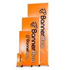
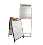
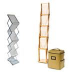
Other synonyms for professional are ‘expert, competent, skilful’. Your banners are a big part of this, and you want them to show off your technical ability as an organisation. Using the right design tools bring this out well. For example, think about the size of the venue as related to the banners. Is there a stage and are there banners on it? Can they be seen from the back? What about the side banners? Start with a floor plan with cut-out banners.
Also Read This: Tips for a Fantastic Conference
Move the cut-outs around the paper to find the best positions for them, then decide what message goes on which banner. This matters because the pull-up banners on stage need to have large enough fonts and short enough messages for the guests at the back to read. The side retractables can use smaller print and more detail because people will be right next to them and can come closer if they want to read the banners.
Another consideration is the styling of the venue. Event managers who plan ahead come off as really capable, so if it suddenly starts raining and you can smoothly move people into a shaded area and transport your portable, waterproof banners, then you look like you know your stuff. Guests immediately label you as a brand that can get things done, all because you checked the weather report and planned accordingly.
Shades of expertise
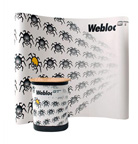
Colour is another aspect that doesn’t receive enough attention at corporate events. The low-reaching fruit is to pick loud, attention-grabbing tones that will force guests to look at banners. However, this may not be in keeping with your brand. After all, neon banners at a bank gathering can only be termed as unprofessional. Pick colours that communicate. Colour theory is critical here.
You want to stay within your brand palette, but you want to use the psychology of colour to create the right mood for your event. Music and lighting help with this but test your banners under the LEDs. Certain shades will look completely different when the bulbs are changed, so double-check that aspect. While you’re at it, test for glare levels. Always use experienced designers for your banners. You don’t want them looking shoddy and amateur. It reflects badly on your brand.
For banners that will send the right message at your corporate event, call Display Systems today on 1300 Displays.